Freshpress
2024
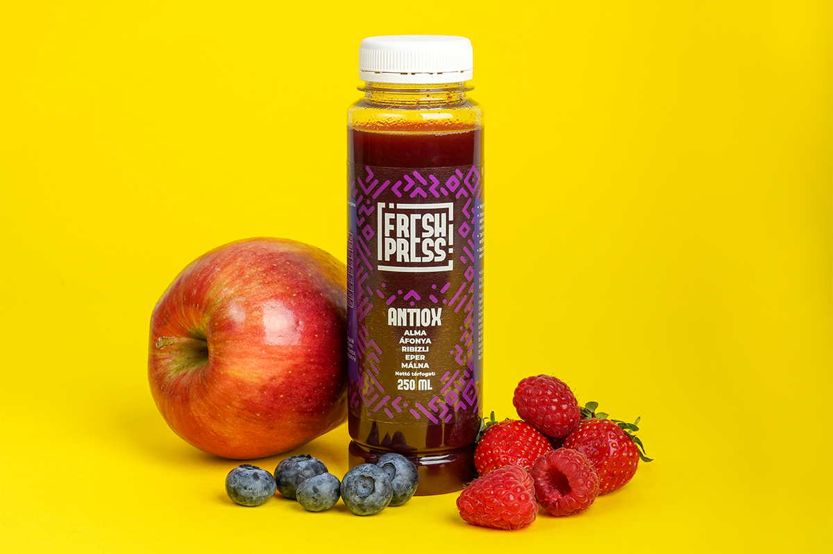
The objective was to create a fresh-pressed juice brand with a distinctive visual identity that could stand out in a competitive market and be easily recognized both locally and internationally.
The brand needed to combine strong shelf presence with innovative technology and a clear consumer proposition.
We supported FreshPress from brand strategy through to market launch.
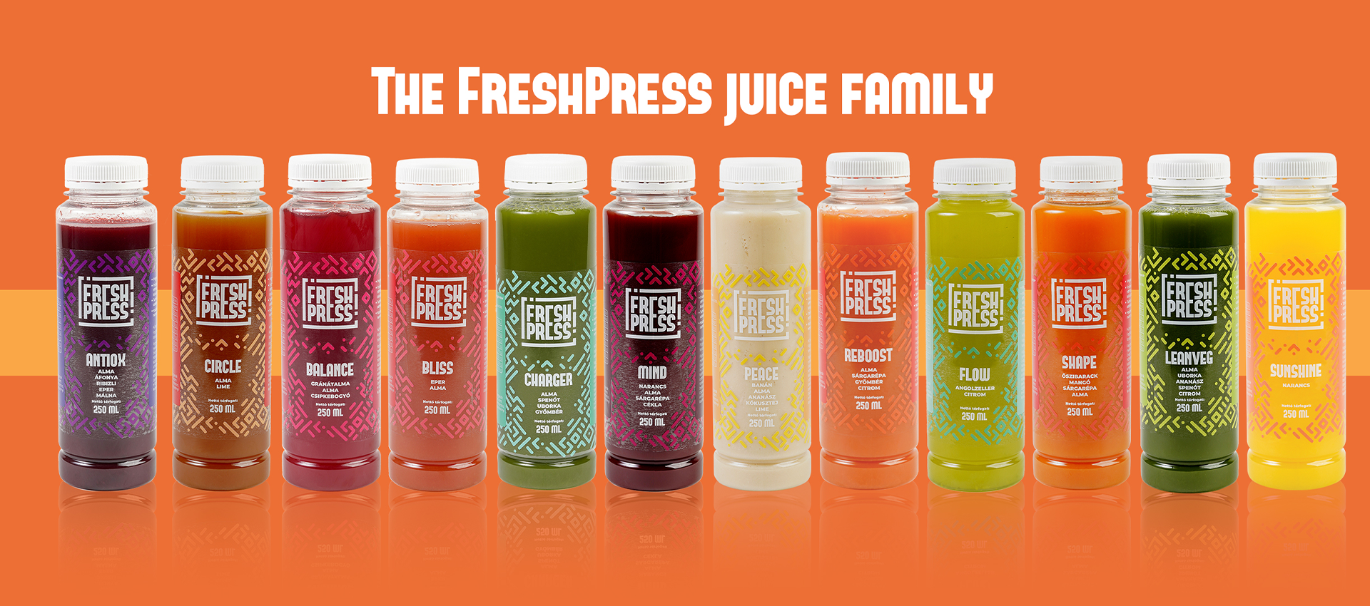
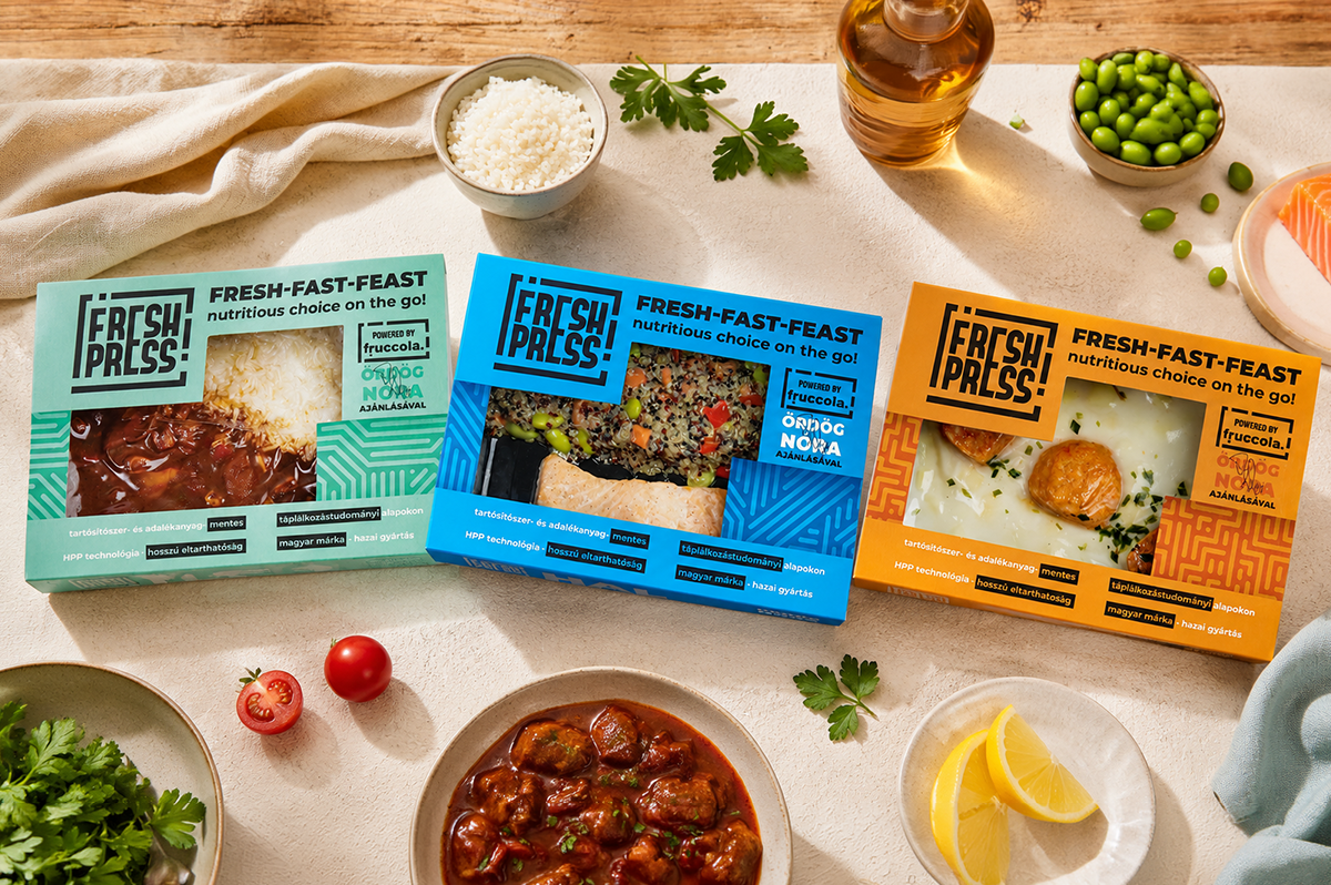
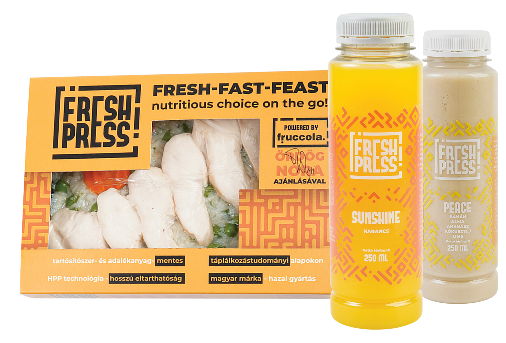
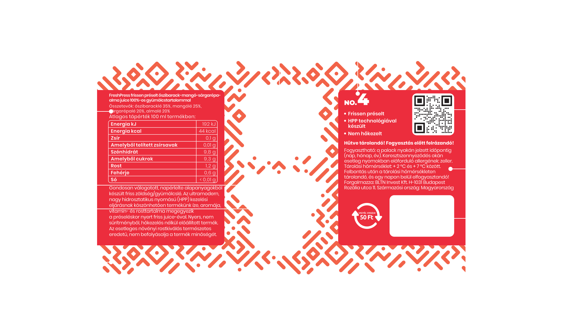
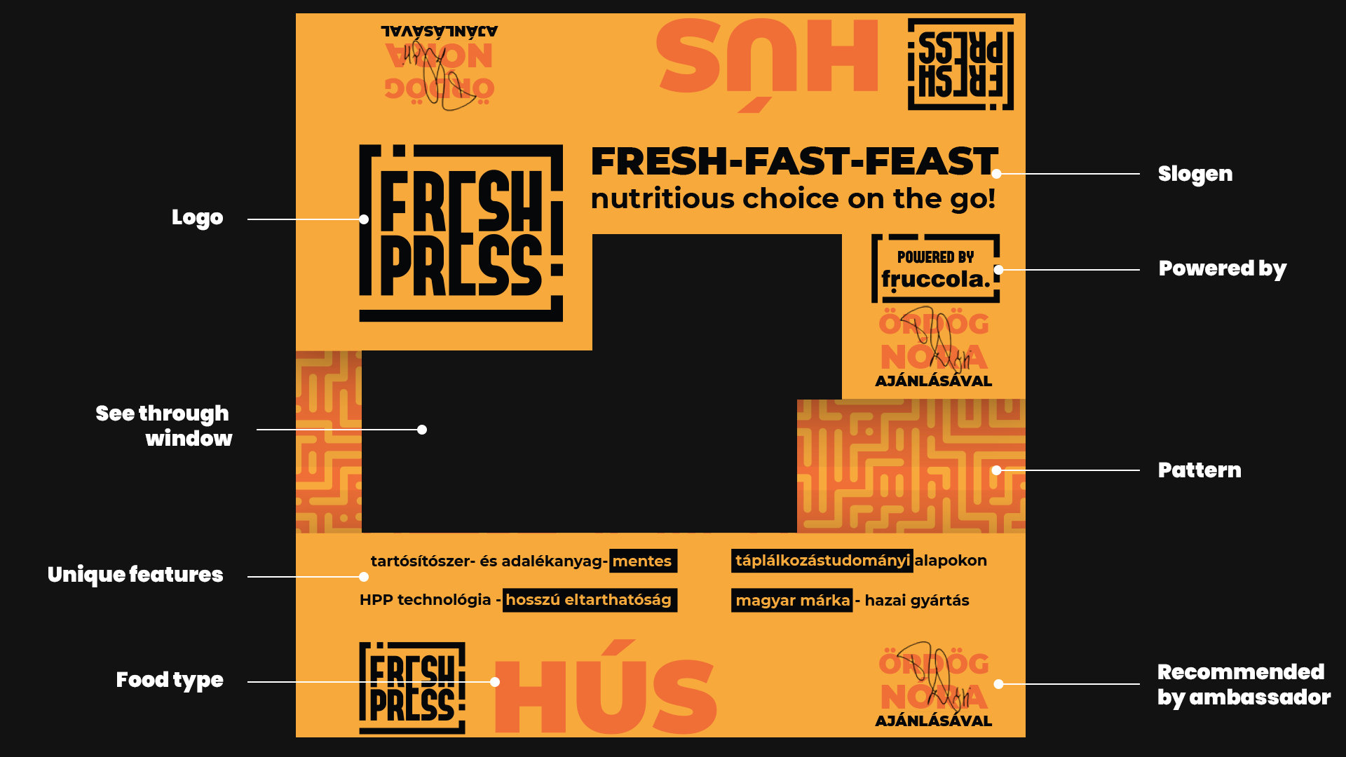
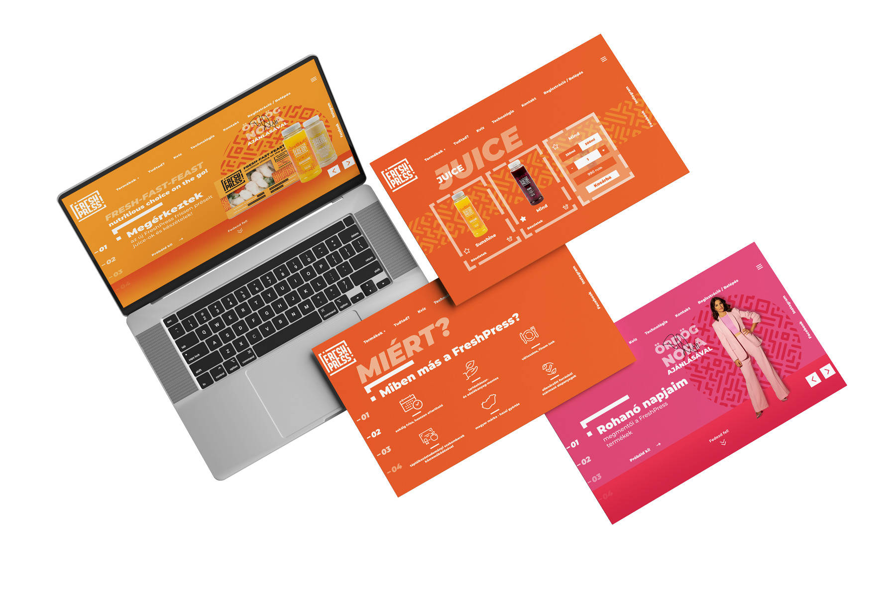
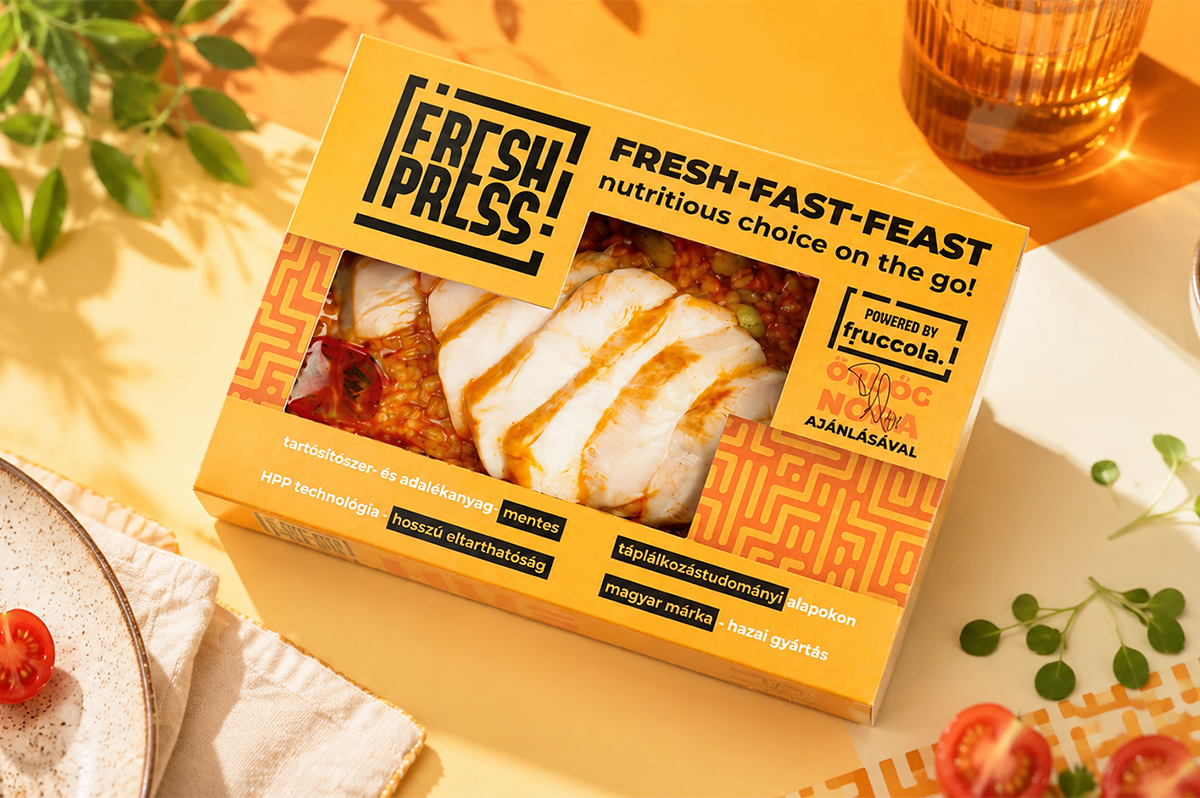
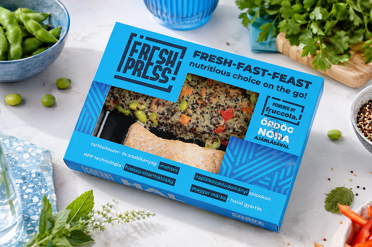
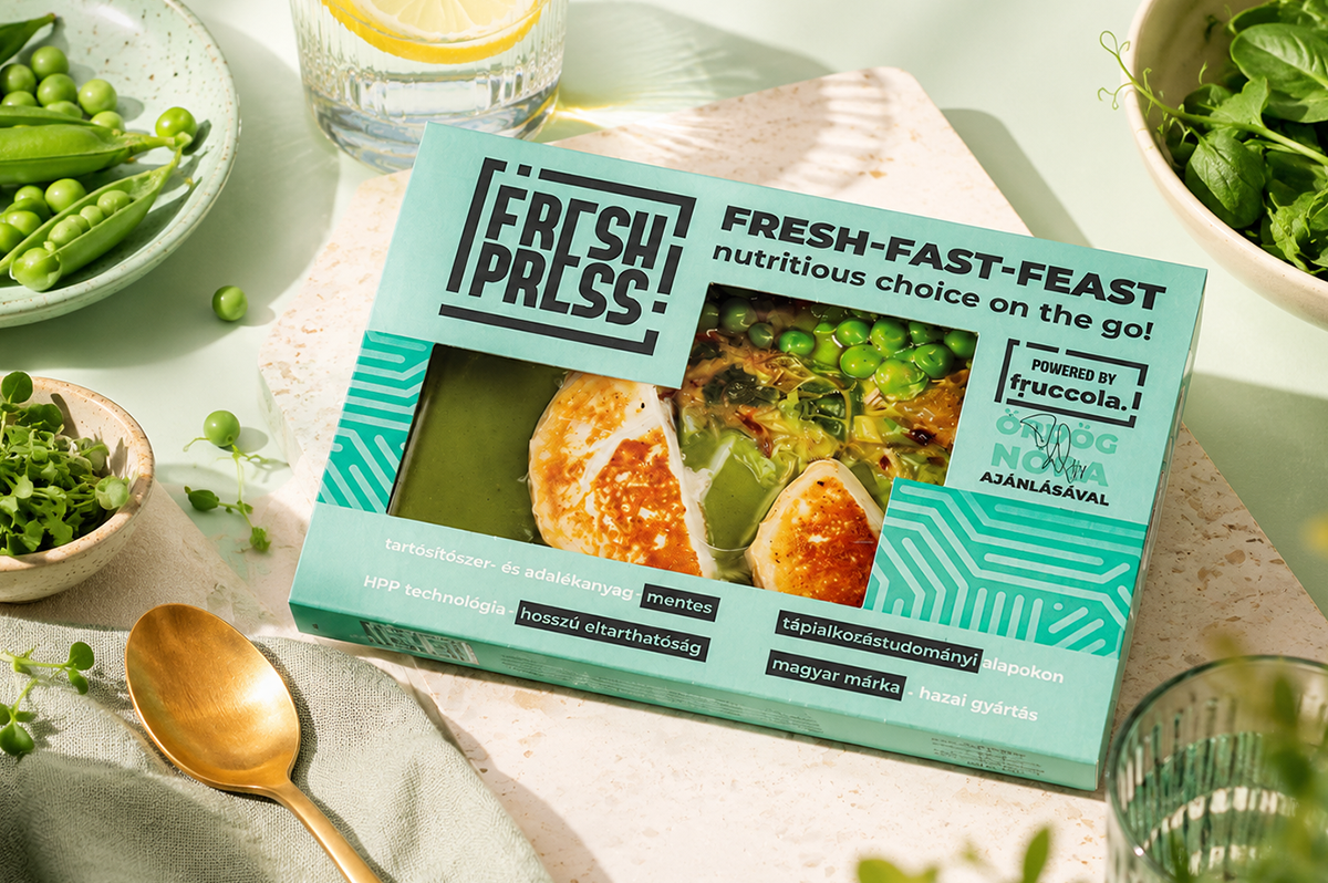
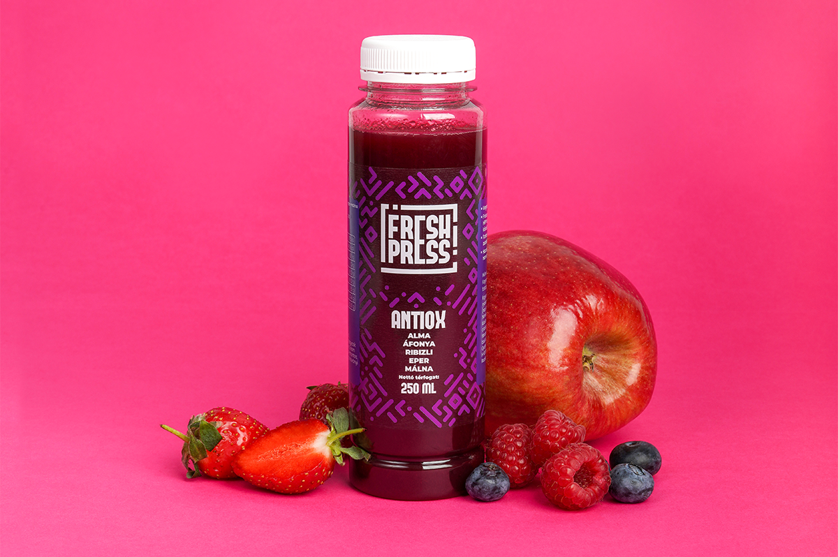
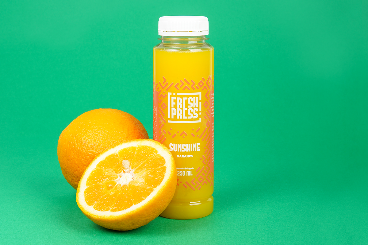
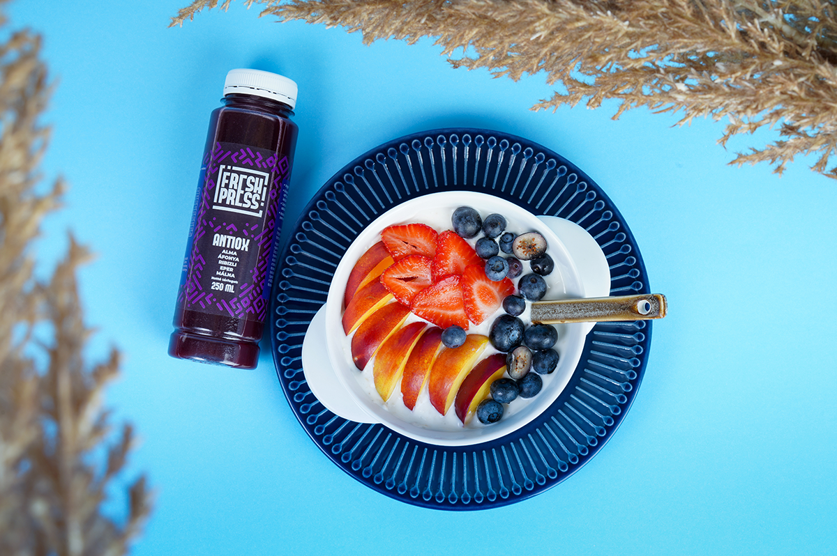
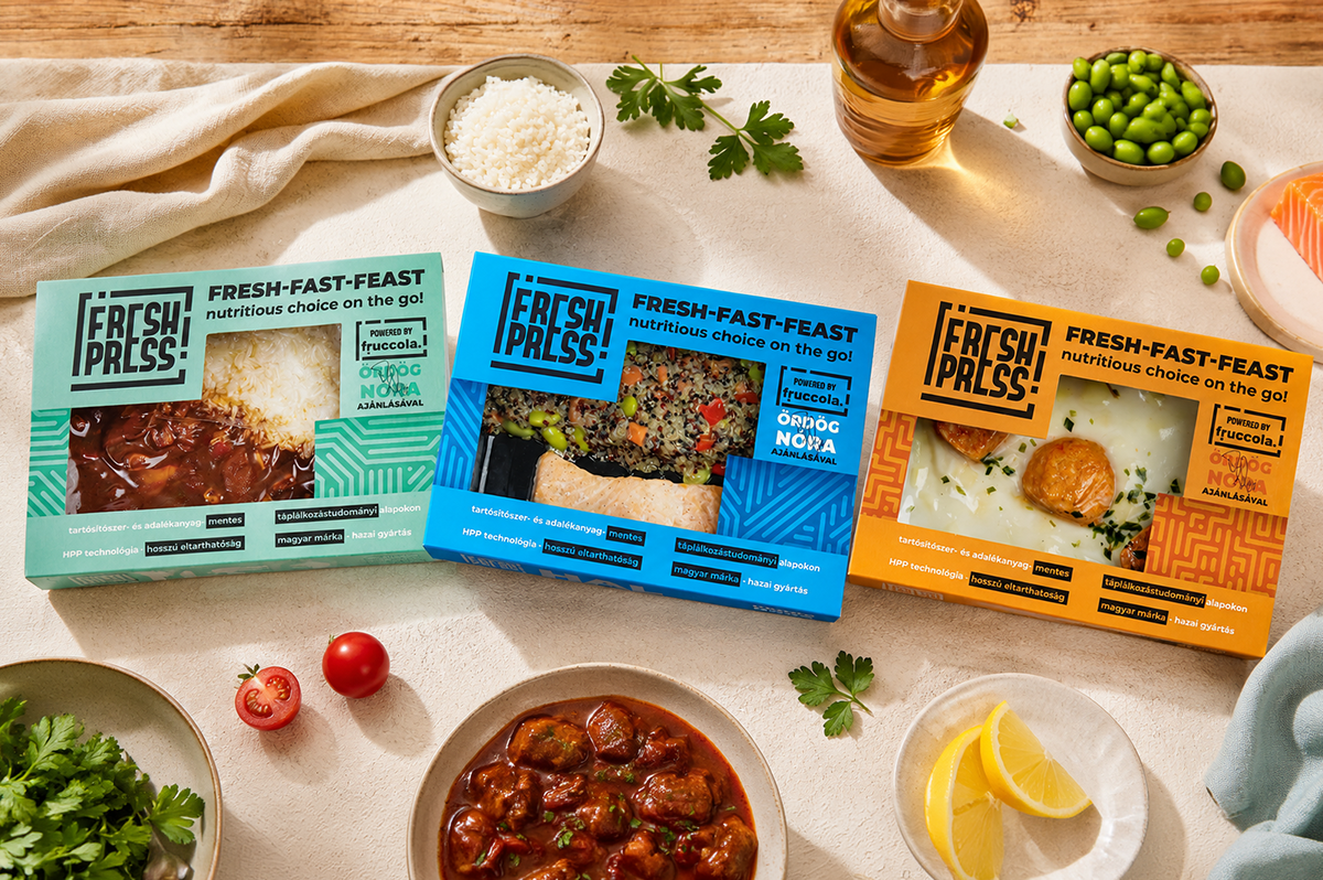
We developed the brand name, a flexible visual identity system, the packaging architecture and the website, creating a consistent brand experience across every touchpoint.
As a strategic partner, we also supported the go-to-market process, including preparations for the Kifli listing and the development of sales and trade presentation materials.
We use brand archetypes to turn strategy into a clear and consistent personality. They give a brand a recognisable human character, helping people understand what it stands for and connect with it on an emotional level.
An archetype also provides a strategic compass, guiding how the brand looks, speaks and behaves across every touchpoint, while helping it remain consistent as it evolves.
We believe a strong brand personality has to be authentic to what stands behind it.
For FreshPress, we looked at the product itself, its innovative HPP technology and natural character, but also at the vision and personality behind the business.
Together, these elements led us to the Explorer archetype, which became the strategic foundation for the brand we built.
To possess the liberty to roam and uncover new horizons.
Bypassing the crowded highway to chart an unexplored trail.
To live an exciting and fulfilling life.
The Explorer personality gave us a clear creative direction: fresh, curious, contemporary and open to discovery.
The visual world was designed to express this character while giving FreshPress a distinctive and recognisable presence in the juice category.
We supported FreshPress from brand strategy through to market launch.
We developed the brand name, a flexible visual identity system, the packaging architecture and the website, creating a consistent brand experience across every touchpoint.
As a strategic partner, we also supported the go-to-market process, including preparations for the Kifli listing and the development of sales and trade presentation materials.
This highlights how the colors interact within the pattern. The term „color duos” reinforces the two-by-two palette setup,
while „in harmony” indicates that the selected shades do not clash; rather, they are balanced to produce an aesthetically pleasing, unified effect.
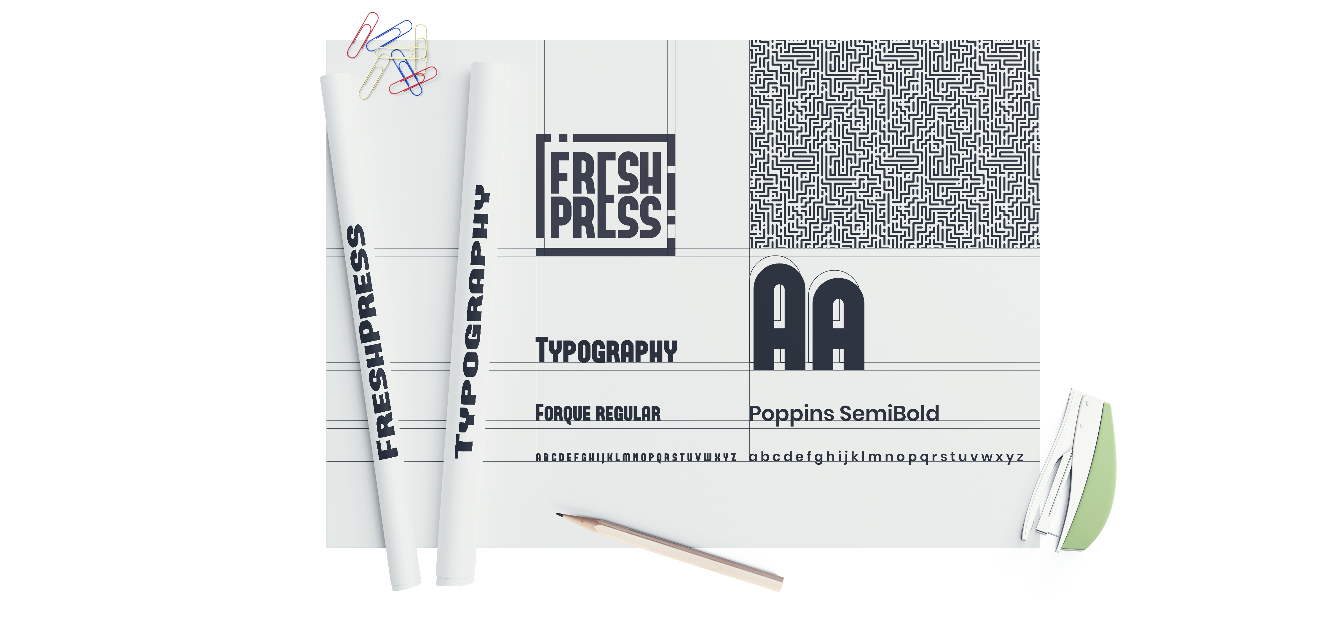
A bold and contemporary typographic system adds personality and energy to the brand, balancing strong visual impact with clarity across different formats and touchpoints.


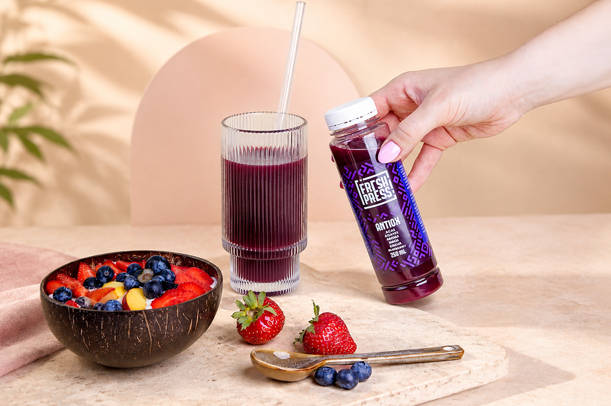
The brand personality was carried consistently across every consumer touchpoint, creating one recognisable FreshPress experience from the shelf to the digital environment.
Packaging, website, social media and digital content all became part of the same coherent brand world.
Brand creation did not stop at defining how FreshPress should look and communicate.
We translated the brand strategy and proposition into sales and trade presentation materials, helping prepare the brand for the commercial reality of entering the market.